
Gallery Pastry Shop
Gallery Pastry Shop
This mural is cleverly camouflaging a walk in freezer built out onto the courtyard at the gallery. Because who doesn’t want to have giant Monarchs joining you for crepes and mimosas?!

Posh Petals Indianapolis, Indiana
Posh Petals
This used to be a white brick storage warehouse. Our dear friends opened the business and needed to do something that would put their business on the map, as they say. Using the architectural detail of four inset panels on the side of the building, we painted one huge poppy. Each with it’s own bright color pop-py out against the rich earth background, that says flowers.
We then we added the Posh Petals logo prominantly on the side and front of the building. Also tying the front and side together is the two tone green and magenta color scheme. A Damask pattern then hand painted on the awnings. Posh Petals continue to be a thriving business and one of our local landmarks!


Angies List. Indianapolis, Indiana
The idea here was to create an interesting mural that stands alone, yet hints of the business that it represents. A sign this big needs to pass strict zoning rules and regulations. Words advertising your business must be 20% or less of the entire space, so a sign can not take up an entire wall. Art however is wide open, there are no size restrictions. We thought the pegboard of tools in most dad’s garages would be relatable to everyone, And would allude to the business within. Angie’s list connects you to repair men, contractors, and other service professionals, (the guys with the tools). Sadly Angies list was bought out and this building no longer housed the business. Thankfully it is still a great mural that speaks to people, so no need to paint over it; as it is now a local landmark!

Pearl Alley
This Building has seen many business incarnations come and go. And so were the signs painted on it’s exterior. We deciphered a few old ghost signs, or billboards painted or the former business owners. Recreating what was believed to be a Quaker oats billboard, we created ads for a few of those former tenants. Henry’s bee keeping supply, E.P. Walker candy company and triple F Coffee.


Pencils

sketched out

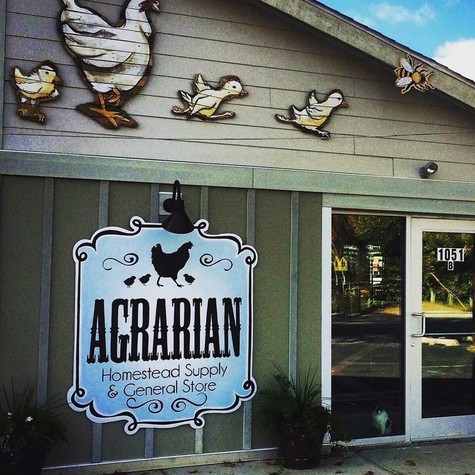
Agrarian, Homestead Supply
Agrarian
This is an example of a customer wanting a sign made of an existing Logo. This sign was hand painted onto a light weight and durable sign board.
For an accent we created a hen, two chicks and two bees made from wooden slats.

Cornerstone Tasting Room
This iconic restaurant and building was in desperate need of a face lift. Color consultation started the process here. The business owners wanted to stay in a familiar palette, so using some of the existing colors and adding a few new shades, we were able to accent the arctitectural features of the building.
The result here was the friendly and approachable, neighborhood vibe that our client was looking for.

Erin Young Designs
This client wanted a visible but understated sign for the outside of her business. With a sign, it’s important to say a lot in two seconds. Clean and concise it tells you what’s inside.

Home Room
This exciting business has limited space for signage. because of this easy one story access painting directly on the building was the way to go.
Large scissors are painted on the front door……Upholstery get it?

Home Room
When Visiting Home Room Just look for the Scissors on the front door.
Having a landmark like this on your front door really makes it easy for your customers to find you!

National Take Your Bird To Work Week!
This Mural/Signage was painted on an unsightly garage door. It is a storage garage for a water softener company. This door faces the Monon trail and brings awareness to the business and what they do by all of the joggers and cyclists that pass by every day.

Civvies
small boutique, small signs; big impact


Gallery Pastry shop
Logo painted on the building with understated illustration

Mass Ave Toys
This nostalgic toy store needed iconic characters to welcome customers to the store.

Uptown Pup
For this doggy daycare and grooming salon, we created an image for the side of their building, Starting with the existing logo, we surrounded it with happy playing dog silhouettes. The business owner did not want bright colors but a sophisticated palette of soft green with deep blue gray, black and white.

Plenty
Plenty lifestyle and gift shop is a fantastic place to find special and unique thank yous and treats for yourself. This signage was created out of palette wood to reflect the vibe of the funky items inside.

Hand Painted Lettering!!!
This hand painted lettering will last for years longer than a printed sign. It was precisely painted with high quality exterior latex paint.


hand painted graphics
hand painted graphics

another Ghost sign
This iconic pizza chain has a new store in the old movie theatre in Vincennes Indiana. We painted their sign on the building as if it were a revived ghost sign so to feel like an original part of the town’s history.


Good Morning Mama's!
This Neighborhood landmark used to be a Phillips 66 gas station but now it’s an Iconic Mom and Pop diner for “real good food and a laugh or two”.

Indianapolis history
This quote was said at the end of a radio commercial for the iconic Indianapolis Business, Richard Bennett Furniture. “ Mother Put the coffee pot on, I’m coming’ home”, is how the commercial ended every time, becoming the tag line that everyone associated with the store.

funnie and sassy
The walls of Good Morning Mama’s restaurant are painted with illustrations representing menu items, some are cute, and some are funny, like this cheeky image! Who doesn’t like a good italian Sausage now and then….


Hotel Broad Ripple
This 100 year old house is the front of a hip little boutique Hotel in the heart of Broad Ripple Village. Painting directly on the brick this is a traditional and economical way to make a sign.

Titus Bakery in Lebanon Indiana
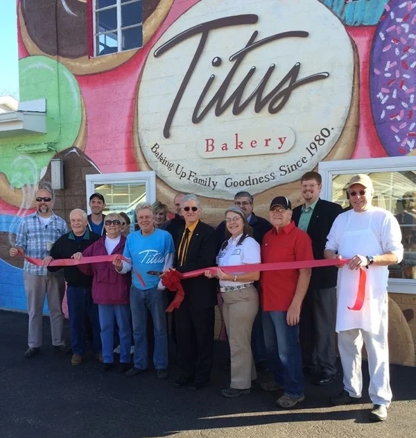
This bakery was in a plain gray cinder block building for 20 years. Locally popular but invisible to the passerby. Painting the building in a cheery butter yellow, accented in hot pink/red along with huge menu items on the exterior of the building made people take note in a big way. Even some locals realized for the first time that this was indeed a bakery. After painting the building their sales tripled within two years and now they have a second location!!
Visible Identity is everything.


Office Lobby
This business logo was painted on a shipping container that was incorporated into their interior design. A conventional printed sign was not the look they were going for, and this ribbed surface was a challenge but a hand painted version of their logo gave the look that they were striving for.

Creative Signage
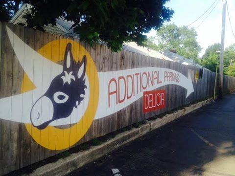
If you need an attractive and bold way to communicate some information to your customers, here is a good way to direct the public to more parking and also dress up an old wooden fence. Proper primer and materials assure that the sign will last many years.

Duesenberg Motors
This Indianapolis Landmark building was originally an automobile factory making the luxury Duesenberg cars of the early 1900’s. This building is now the City Bus Terminal, The management was insightful in bringing out the history of their Administrative offices.

Marmon Herrington
This Company was responsible for building busses. Research uncovered a photo of this building in it’s early years. The photo depicted the Bus production assembly line. Unaware of this history, the current occupant of the building oddly enough is the City’s Bus Terminal.

Good Morning Mama's!
Mr. Bluebird’s on your shoulder when you visit the kitchy Landmark Diner.
Once a Phillips 66 gas station, this iconic breakfast place is constantly crowded. The food is good, and the atmosphere is GREAT! Think about how we can help turn your business from Good into Great with our artistic vision.

Bakery
Grand opening and Ribbon Cutting!

Bakery Opening
Grand Opening and Ribbon Cutting!


